Secrets of the SPC: How daily convective outlook graphics are made
It's not just simply drawing blobs on a map. Each outlook goes through a meticulous process by meteorological experts poring over mountains of data from computer projections, weather balloons, observations, and satellites. Follow along how it's done.
The science behind NOAA's convective outlooks
Meteorologist Liz Leitman on the importance of severe weather data coming from the Storm Prediction Center.
NORMAN, Okla. -- Almost every day, meteorologists -- both professional and armchair -- flock to NOAA's Storm Prediction Center site to get the low-down on any expected severe weather in the nation.
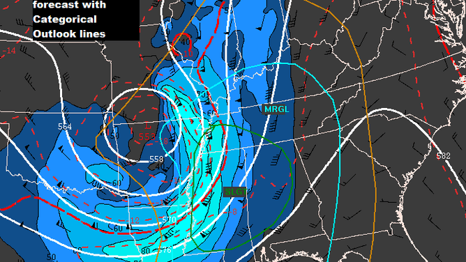
The SPC, based in Norman, Oklahoma, oversees messaging and forecasting any potential large-scale severe weather. Their popular convective outlook maps display risk levels for general severe weather threats and specific maps detailing risk for tornadoes, large hail and damaging wind gusts.
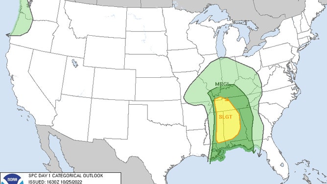
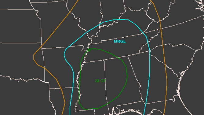
The SPC Convective Outlook for Oct. 23, 2022.
(NOAA Storm Prediction Center)
For the general severe weather outlooks, the maps show areas of expected general thunderstorms, then paint risk on a 1-5 scale for increasingly dangerous outbreaks of severe weather. The SPC will issue outlooks for the current day, the next day, the third day, and then an extended forecast for days 4-7.
THE 5-POINT SEVERE THUNDERSTORM RISK CATEGORY SCALE EXPLAINED
But it's not just drawing blobs on a map. Each outlook goes through a meticulous process by meteorological experts poring over mountains of data from computer projections, weather balloons, observations and satellites.
(Elizabeth Leitman)
SPC meteorologist Liz Leitman recently gave a first-hand look into how the outlooks are crafted as she tweeted along while she created Oct. 24th's Day 2 Convective Outlook.
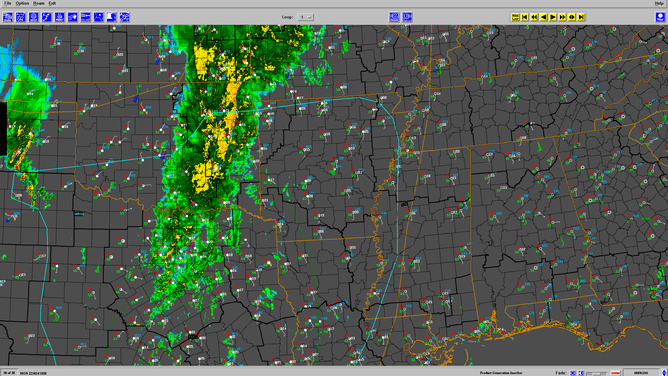
The process begins with special software available to NOAA forecasters that allow meteorologists to view current model projections, weather observations and upper air data from weather balloons.
"We have thousands of fields of numerical models — basically predictions of what the atmosphere might look like in the future, and we pore over these model data," Leitman told FOX Weather. "We use weather balloons observations, satellite, radar observations, machine learning guidance (and) we synthesize all this data to come to conclusion of what we think is going to occur… and then we draw our areas that we think will have a risk for each of those individual days."
(Elizabeth Leitman)
She says she'll first get a look at the big picture, a grasp of the large-scale weather pattern.
(Elizabeth Leitman)
In addition to the vast amount of current weather data available, she'll use both traditional forecast models that paint a single forecast for each point in time, then use "ensemble" forecast models, which make multiple forecasts for the same time and place based on minor tweaks in initial data.
These models calculate a range of most likely outcomes and can lend confidence to a forecast -- or a lack thereof -- if the ensembles largely agree (or disagree) on a specific outcome.
(Elizabeth Leitman)
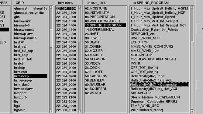
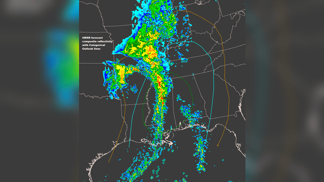
Next up are using the higher-resolution, shorter-term forecast models -- a relatively new tool developed that can run forecasts at higher resolutions, more frequently over shorter forecast time scales to detect smaller-scale events such as supercell thunderstorms better or pick out additional details along a frontal boundary.
HOW TO WATCH FOX WEATHER ON TV
(Elizabeth Leitman)
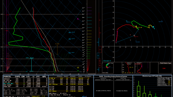
Then it's on to upper-air weather data provided by twice-daily weather balloon launches. "I look at dozens and dozens of soundings during the forecast process," Leitman says. NOAA has developed its in-house tools that analyze data from weather balloons and gives statistical predictions of what similar weather observations have produced in the past.
ACCURATE FORECASTING WOULD BE ALMOST IMPOSSIBLE WITHOUT WEATHER BALLOONS
(Elizabeth Leitman)
Finally, she'll use another new entry in the forecaster toolbox: Machine learning guidance. The National Center for Atmospheric Research in Colorado has developed a model that uses artificial intelligence trained from 500 past forecasts of a high-resolution model that was then matched to actual conditions. The machine analyzes 40 current weather measurements and uses what it learned from experiences to give detailed probabilities of tornadoes, large hail and damaging wind.
(Elizabeth Leitman)
Now the severe weather forecast is crafted. How do we get it out to the public? They have a tool called "pgpalette" that allows them to draw their products on a map with separate layers for severe weather levels and probabilities of hail, tornadoes and damaging wind.
(Elizabeth Leitman)
She can draw circles on the map, with guidance from the previous severe weather outlook, to show what changes, if any, she is making to locations under severe weather threats. When significant risks of severe weather are present, forecasters will have to draw multiple layers to denote the varying levels of risk.
(Elizabeth Leitman)
"You can see how quickly things can get busy with the lines if we have higher probabilities in an outlook!" Leitman tweeted.
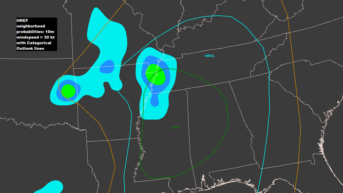
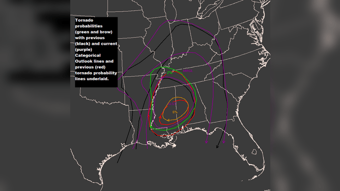
In addition to the overall severe weather risk, forecasters will also paint contours on maps for individual severe weather threats, such as the probability of a tornado, large hail or damaging wind.
Once the color plots look good and match their intended forecast, forecasters turn to writing the forecast discussion explaining the reasoning behind their forecasts and providing additional details on timing, scope, and expected impacts.
They'll next spend time talking with the local National Weather Service forecast offices where severe weather is expected to discuss any needed changes or upgrades in severe threat. Finally, the outlook is issued to the public to be tweeted and discussed among the masses while helping local meteorologists, media representatives, and emergency managers prepare for potential threats.
"The whole (outlook) process can take 45 minutes on a quiet day to 2.5-3 hours on a busy or complex day," Leitman said.