Show Your Stripes Day: How a colorful graphic raises awareness of climate change
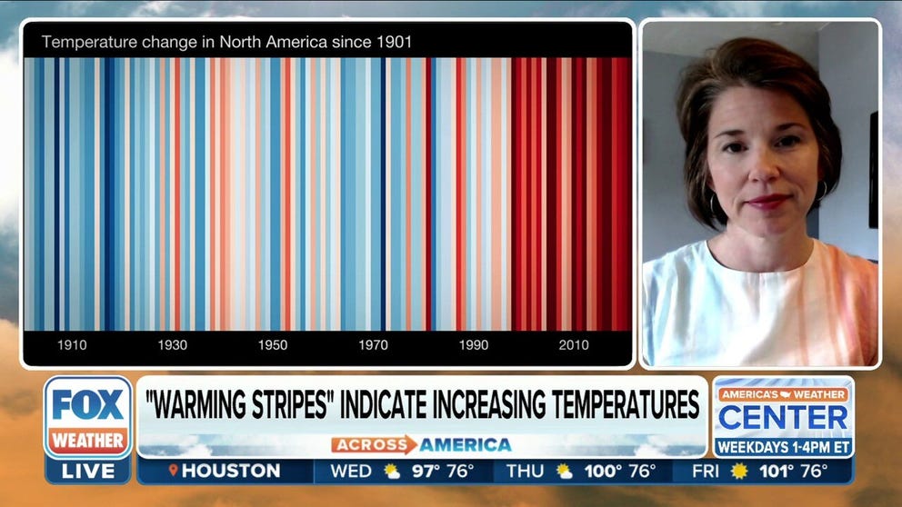
"Warming Stripes" show how temperature has changed for more than a century.
How a colorful graphic indicates a global warming trend
File: Bernadette Woods-Placky, Climate Central Meteorologist, on the importance behind Show Your Stripes Day in 2022.
The first day of summer is also Show Your Stripes Day.
The observance was created in 2018 to raise awareness of climate change. At the center of the effort is a colorful graphic called "Warming Stripes."

U.S. warming stripes through 2023.
(Climate Central / FOX Weather)
According to Climate Central, a nonprofit independent group of scientists and communicators, the concept was created by climate scientist Ed Hawkins. It features lines of various shades of blue and red that are stacked left to right, indicating how temperature has changed for a given location over a certain amount of time. Blue represents a cooler-than-average year, while red represents a warmer-than-average one. Darker colors represent a bigger departure from the average.
In the example below, the stripes represent the global temperature change from 1850 on the left to 2023 on the right. The bulk of the world’s warmest years in the past 173 years have happened in the past few decades.
MAGIC MUSHROOMS: SCIENTIST SAYS FUNGI COULD REVOLUTIONIZE CLIMATE CHANGE FIGHT

Global warming stripes from 1850 to 2023.
(Climate Central / FOX Weather)
How to create a ‘Warming Stripes’ graphic for where you live
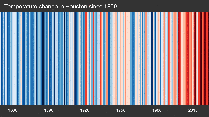
Climate Central has created "Warming Stripes" graphics for 178 cities, 49 states, the U.S. and the globe that include available data up to 2023.
To find the graphic for your city, click here and select your location from the drop-down menu. Here’s examples for Houston, New York, and Jacksonville. Compare the stripes to the more traditional temperature change bars after each city.
‘SIRENS ARE BLARING': UN CLIMATE REPORT SAYS 2023 WAS ‘OFF THE CHARTS’
(Institute for Environmental Analytics / FOX Weather)
To find the graphic for your state, click here and select your state from the drop-down menu. Here’s an example for Texas, Florida, New York and the entire U.S.
HOW CLIMATE CHANGE IMPACTS EXTREME WEATHER
![]() Image 1 of 4
Image 1 of 4Temperature change in Texas from 1895 to 2022. (Climate Central)
![]() Image 2 of 4
Image 2 of 4Florida's warming stripes through 2023. (Climate Central)
![]() Image 3 of 4
Image 3 of 4New York's warming stripes. (Climate Central)
![]() Image 4 of 4
Image 4 of 4U.S. warming stripes through 2023. (Climate Central)


You can also go to showyourstripes.info and find graphics down to city level for the U.S.