NOAA's Climate Prediction Center launches new maps for long-range temperature and precipitation outlooks
New look will be used for the 6- to 10-day, 8- to 14-day, monthly and seasonal outlook maps
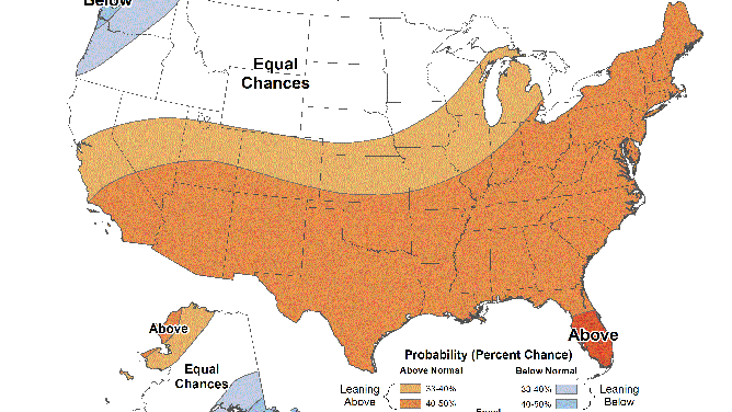
NOT A CURRENT FORECAST – An example of the new look for the seasonal temperature outlook issued by NOAA's Climate Prediction Center.
(NOAA's Climate Prediction Center)
NOAA's Climate Prediction Center launched a new look to its long-range temperature and precipitation outlook maps on Sept. 15.
The goal of the upgrade is to better communicate climate outlooks issued for the United States by making it easier for the general public to understand the information displayed on the maps.
The new maps will be used for the CPC's 6- to 10-day, 8- to 14-day, monthly and seasonal outlook products.
"After considerable research and collaboration with partners and users, we are pleased to offer these now-operational upgraded climate outlook maps for our partners and the public," said Jon Gottschalck of the CPC Development Branch. "Since our efforts on this project began in 2017, our team at CPC has worked collaboratively and creatively to deliver these newly visualized maps to our stakeholders."
CPC worked with the University of Maryland's Cooperative Institute for Satellite Earth System Studies to develop the new look for the maps. Additionally, user feedback was also incorporated to ensure the upgraded maps deliver on their goal of clearly communicating upcoming climate outlooks.
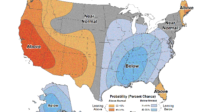
NOT A CURRENT FORECAST – An example of the new look for the 6- to 10-day temperature outlook issued by NOAA's Climate Prediction Center.
(NOAA's Climate Prediction Center)
"I think they are a big improvement over the old maps. Unless you knew what you were looking at, the old maps weren't exactly clear as to what they were showing," said FOX Weather meteorologist Greg Diamond. "These new images are clear that it's showing where above- and below-average temperatures and rainfall will be. It's also more visually appealing, and the higher resolution is great for people to more clearly see their location."
NOAA noted that other maps, including those for the CPC's Week 3-to-4 temperature and precipitation outlooks, will also undergo a visual upgrade in the future.
"This is a major step in the right direction for clear weather graphics," said FOX Weather meteorologist Allan Nosoff. "Moving to a simpler, less cluttered map that highlights the temperature or precipitation information in an easy-to-digest way makes it easier for everyday people to have a proper takeaway from the forecast."
The old maps used labels such as "A," "B" or "EC" to denote above-average temperatures, below-average temperatures or equal chances of each, respectively. This led to a lot of confusion, not only among the general public, but even for meteorologists.
"The CPC outlooks needed to be updated in order to make them more clear and better articulate what they are saying," said FOX Weather meteorologist Marissa Lautenbacher. "I never understood why there was an ‘A,’ ‘B’ or ‘EC’ even as a meteorologist."
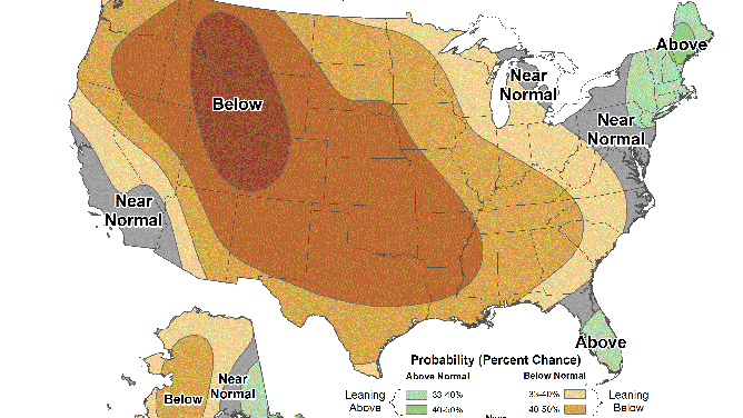
NOT A CURRENT FORECAST – An example of the new look for the 6- to 10-day precipitation outlook issued by NOAA's Climate Prediction Center.
(NOAA's Climate Prediction Center)
NOAA said the upgraded maps provide a substantial improvement in image quality, making them more user-friendly for stakeholders, partners and media outlets. They also deliver increased clarity in visualization and improved messaging in the map legend to aid in better understanding of the data.
"I'm looking forward to the other changes that the NWS will have by getting rid of the advisories soon, and how their forecasting language might follow suit," Lautenbacher said.