How experts 'forecast' the color trend of the year
Culture, psychology and other indicators help determine color trends, according to a powerhouse in the color industry: Pantone
How color trends are forecasted by the experts each year
Color forecasters utilize cultural indicators in travel, art, technology, fashion, sports and entertainment to predict future trends.
Color trends ripple through the market every year, which is why it seems that industries as different as fashion, automotive and tech are virtually in lockstep when it comes to color.
But how?
At the epicenter of this colorful coincidence are a handful of companies that decide what those color trends should be.
By reading the pulse of our culture, powerhouses in the color industry help define relevance and set the tone for what we wear, what we drive, what we type on and everything in between.
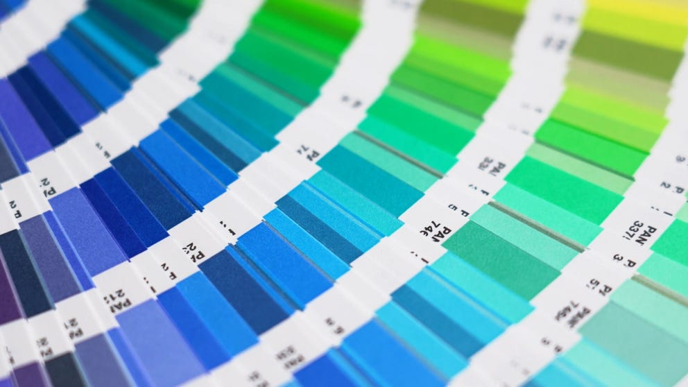
Spectrum of industry
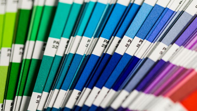
Pantone color swatches
(Christina Rumpf / Unsplash)
"Color is important," said Leatrice Eiseman, the executive director of the Pantone Color Institute and director of the Eiseman Center for Color Information and Training. "Color is one of the first things that people will notice in the marketplace."
Established in 1986, the Pantone Color Institute provides color consulting and brand forecasting that helps designers and brands harness the power of color, according to Pantone.
"Consumers note color," Eiseman said. "They return merchandise because they receive it, and it's not the right color. So, we know it's an important factor. We just want to get people talking about it."
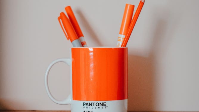
A mug adorned with Pantone color 1505.
(Unsplash)
Some industries were originally skeptical of the importance of colors and color trends, according to Eiseman. In the 1990s, that skepticism started to fade away and industries began to have more conversations about color.
"I think Pantone had a great deal to do with that," she said.
A palette of metrics
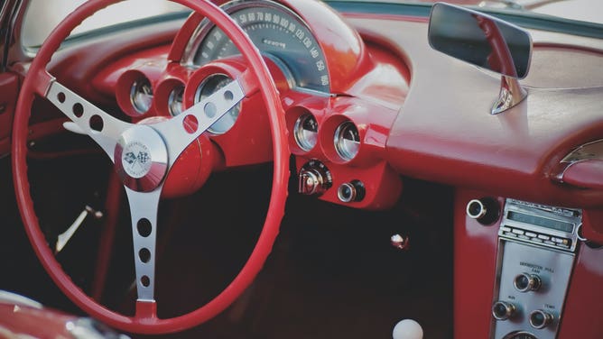
Red steering wheel and dash of a car.
(Scott Webb / Unsplash)
Conversations about color not only involve the importance of colors presently but also of colors in the future.
In a practice called "color forecasting," industry professionals such as Eiseman determine what the upcoming color trends may be. Such a determination provides inspiration for designers and manufacturers across a variety of industries when they create their products.
This is why the market often seems to be flooded with products of the same color each year, as companies take their cues from color forecasters.
"Over the years, that has grown incrementally, and now people look to Pantone for that prediction," Eiseman said.
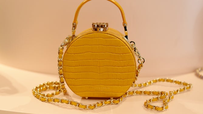
A yellow bag on display.
(Tabatha Fireman / BFC / Getty Images)
"For the most part, with the general audience, there is that expectation: ‘What is Pantone going to choose and what's the reason for it? What's behind it that intrigues everyone?'" she added.
Forecasters at Pantone annually predict color trends with their popularly known Color of the Year.
According to Eiseman, the Color of the Year is the culmination of months, if not years, of research.
"We look at many different, what we call, indicators," Eiseman said. "We have to be looking ahead, we have to be soothsayers, but do our homework at the same time so that it's not something where we all sit around and throw darts and wherever it lands, that's the color we choose."
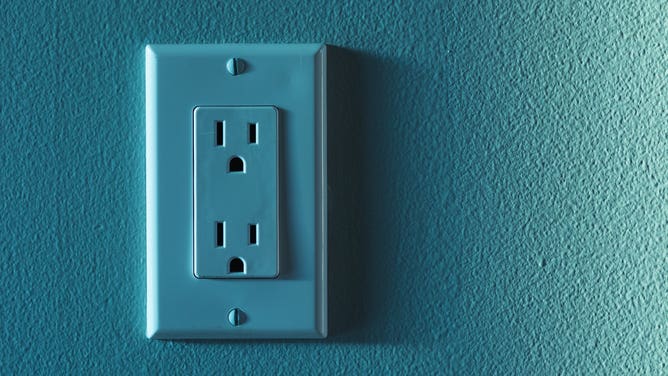
A teal electric outlet on a teal wall.
(Greg Rosenke / Unsplash)
"It is much more thoughtful and much more oriented to doing our homework and researching color direction," she added.
Similar to how meteorologists consider a number of variables when they make their weather forecasts, color forecasters consider a number of variables, as well.
But rather than take their cues from the atmosphere (unless it’s 1999, but we’ll get to that later), color forecasters take their cues from the larger culture and focus on areas such as travel, art, technology, fashion, sports and entertainment.
For example, color forecasters may look at fashion designers to see what risks they’re taking in their art and what colors they’re using, along with fabric houses to see which colors are being expressed in the latest fabrics.
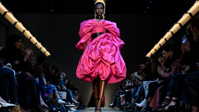
A model sports a hot pink outfit during Paris Fashion Week Fall 2019/Winter 2020.
(Peter White / Getty Images)
Movies and their "color stories" can also be a source of inspiration, according to Eiseman.
"What colors are coming out of those films that are bound to influence millions of people?" she said. "I pay particular attention to what the animators are doing, especially in children's films, because they are so spot-on in the new technologies that are involving color — the digital use of color — and they will create these amazing atmospheres."
But perhaps one of the most significant indicators for a color forecaster is the zeitgeist — the general mood or spirit of the people at a particular moment in time.
Altogether, these indicators inform forecasters of trends and, at Pantone, what the Color of the Year should be.
Millennium Skies

The last sunset of the year 1999.
(Phil Walter / Getty Images)
The assessment of such indicators, particularly the zeitgeist, helped Pantone kick off their Color of the Year tradition in 1999. According to Eiseman, Pantone was receiving a number of color questions at the time, with the foremost being "What color represents the new millennium?".
"We realized that there was this great enthusiasm and excitement, but we had to capture the feeling of, the design of the color, if you will, the psychology of the color," Eiseman said. "It's not just enough to present a color and say 'This is the color of the year'. We feel that's very arrogant. We feel we need to give a reason for that color."
The cultural temperature going into the year 2000 was a mix of highs and lows.
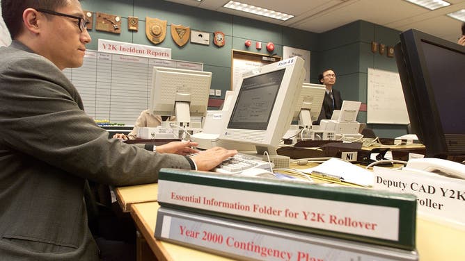
An airport official checks computers as Y2K preparedness manuals lie on his desk. December 1999.
(Robyn Beck / AFP / Getty Images)
On one hand, people were a little frightened, as they were told computers were going to stop at the stroke of midnight. But on the other hand, people were excited about the new century, according to Eiseman.
"We needed a color that would embody both of those feelings, and most importantly, was the feeling of what lies ahead," she said.
So, how did Eiseman and her team capture this forward-looking perspective?
By looking upward.

Blue skies
(Silas Stein / Picture Alliance / Getty Images)
"Let's look at the color of the sky, a beautiful blue sky, because that always says to people there's a constancy or dependability factor," she said. "The water may run over, the earth may shake, but so far the sky hasn't fallen and we don't expect it will."
"Because we delve very deeply into the psychology of color at the Pantone Color Institute, in most people's minds, it means a certain security."
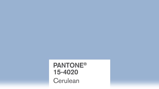
Thus was born Pantone’s first Color of the Year: Cerulean Blue.
![The swatch card of Cerulean Blue, Pantone's Color of the Year for 2000.]() Image 1 of 2
Image 1 of 2The swatch card of Cerulean Blue, Pantone's Color of the Year for 2000. (PANTONE)
![A color chip for Cerulean Blue, Pantone's Color of the Year for 2022.]() Image 2 of 2
Image 2 of 2A color chip for Cerulean Blue, Pantone's Color of the Year for 2022. (PANTONE)

"There is a great deal of thought that goes into choosing the color of the air and that helps to create the trends," Eiseman said.
"When people read about the fact that Pantone says this is representational, the color of the year, and if they're manufacturers or designers, it can place a suggestion with them that perhaps they want to do something in that shade of blue."
Carrying on the tradition
![The swatch card of Very Peri, Pantone's Color of the Year for 2022.]() Image 1 of 2
Image 1 of 2The swatch card of Very Peri, Pantone's Color of the Year for 2022. (PANTONE)
![A color chip of Very Peri, Pantone's Color of the Year for 2022.]() Image 2 of 2
Image 2 of 2A color chip for Very Peri, Pantone's Color of the Year for 2022. (PANTONE)
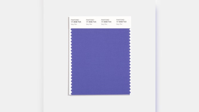
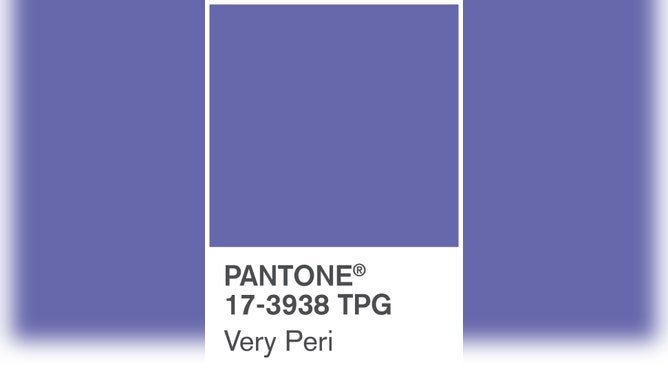
The Color of the Year for 2022 is not only the product of research and reading the cultural pulse of the public, but it is a brand new color in the Pantone collection.
Called Very Peri, Eiseman describes it as a combination of purple and blue, with a blue base that has a red-violet undertone. She added that it has the tranquility and peacefulness that the blue family imparts, along with the energy that the red-violet undertone imparts.
"The reason that we chose that color was that we felt it really personified what people are looking for," she noted. "We felt it was necessary to integrate those two feelings because coming out of COVID, coming out of what we have faced in the last couple of years, we needed a color that would really answer that need."
The color to capture all that 2022 meant, Pantone created Very Peri.
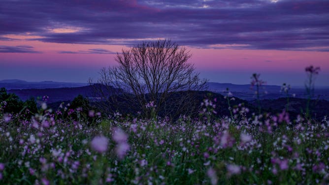
Hints of Very Peri in nature.
(Lucas George)
Eiseman teased that her team is already working on the Color of the Year for 2023, which will be announced later this year, and continue the tradition of color trend forecasting.
"It shows us that at every level — whether it's at top designers, the top companies and the consumer who ultimately buys the goods — are all interested in the subject of color," Eiseman said. "They're all fascinated by it, and I like to think that we started a greater conversation about it."